Okay so last week I shared the plain old black and white line art. And this week I'm back with the color line art!!!
When I first started coloring Monster Guy I wasn't sure how I wanted to tackle it. I certainly don't have anything against color holds, but at the same time, I don't choose to use them that often.
For some reason, I went nuts with the knockouts on this one. I just got really into it. And the process I used for the color holds was a little unconventional for me.
Anyone who knows my working process knows that I have a quirk -- I hate working with my line art layer set to multiply. I prefer to scan in my work as a 1200 DPI bitmap file, and then I separate the blacks from the whites.
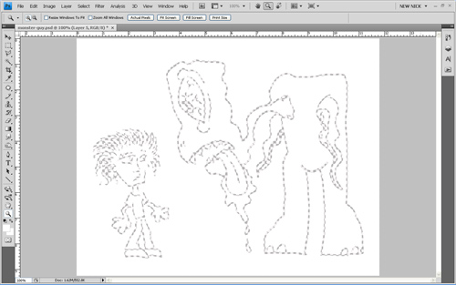
And that's what I did for Monster Guy. But in the process of that, I realized that I was left with a white shell:

I decided to create my color holds by working underneath that white layer and using it as a mask. So, for example, if you were to hide that white shell layer, this is what the colors look like:

Because the white mask layer was originally made from a bitmap and it was composed of rigid pixels, I was able to merge the white layer with the colors underneath, and then easily delete away the white, leaving me with the color line art you see at the top of this post. VOILA!!!
Next time, I'll dig deeper into my interior coloring decisions for the penultimate installment of the Monster Guy artistic process!


